Morgs Pots came to us with an online store that wasn't turning enough visits into sales. The mobile experience was awkward, the products were poorly presented and one of the strongest reasons to buy, free Australia-wide shipping, was buried. We handled the strategy, design and Wix development, rebuilding the path from homepage to product choice and checkout so shoppers can see the offer and act on it without hunting.
The old store made shoppers dig
Morgs Pots already had useful products and a genuine sales hook. The site made both hard to see. On mobile, the layouts didn't help someone compare items or move towards checkout. Product photography, names, pricing and benefits didn't work together, while free Australia-wide shipping sat where a visitor could miss it. Before changing the visuals, we worked out what needed to be obvious in the first few seconds.
Lead with the reasons to buy
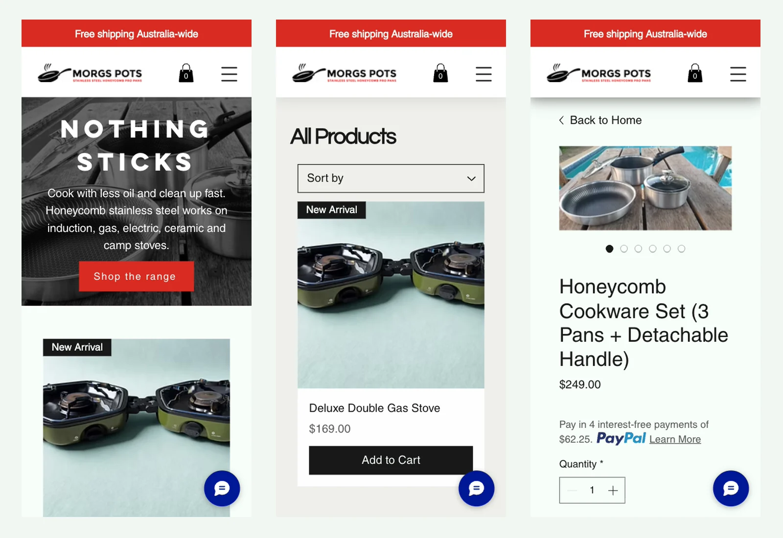
The redesigned homepage opens with the cookware itself, the Nothing Sticks message, a short explanation of where the pans work and one Shop the range action. Free Australia-wide shipping now sits in the announcement bar above every page. The product range follows immediately, so a shopper can move from benefit to item without reading through background copy first.
Make the catalogue do its job
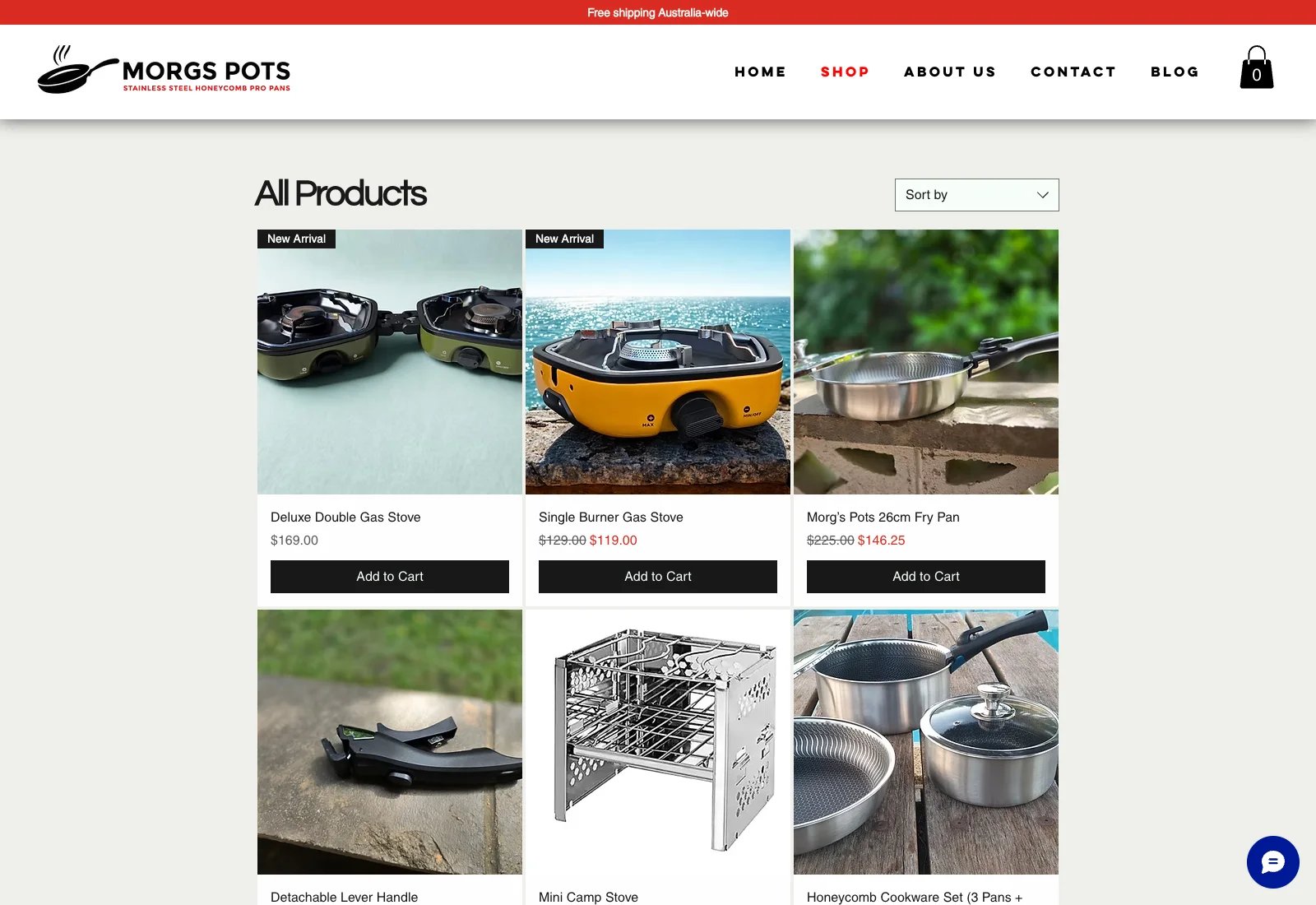
On the shop page, each item gets consistent space for photography, name, price and an Add to Cart action. The product pages put the image gallery, benefit-led description, price, quantity and purchase control in one clear layout. Details such as compatible cooktops, detachable handles and compact storage are part of the buying decision, so they aren't left at the bottom of the page.
Mobile needed its own composition
The narrow layout wasn't treated as a shrunken desktop page. The shipping message stays at the top, navigation collapses cleanly, the hero copy remains readable and products run in a single column with a full-width purchase action. On product pages, imagery leads into the name, price and checkout controls in the order someone actually uses them.
Build notes
- Reworked the store around the questions a shopper needs answered first: what the cookware does, where it works, what it costs and how to buy it.
- Moved free Australia-wide shipping into the announcement bar above every page instead of leaving a strong sales reason buried in the site.
- Rebuilt the homepage to lead with the cookware, the Nothing Sticks message, a short benefit statement and one direct Shop the range action.
- Gave the product grid consistent photography, names, pricing and add-to-cart controls so the range is easy to scan and compare.
- Restructured product pages around the image gallery, useful product detail, price, quantity and purchase action rather than making shoppers search for the important parts.
- Designed the mobile layouts around a single-column buying path, with readable hero copy, compact navigation and full-width purchase controls.
- Built the finished store in Wix, using its catalogue and commerce tools while making the public design specific to Morgs Pots.